As a some-what frequent traveler to Kansas City, I have watched the building of the new international airport from a distance. From inside the old seventies-style terminals, everyone could see the nearby project developing on the horizon over the past two years. I did not know what to expect, but the plain boxy look did not look promising.
Perhaps my expectations were too high. I believe that airports should be distinctive, not just functional. They should tell the traveler about the place they are entering. Indeed, an airport should introduce us to the people of the area. In times past, the city train station had a touch of grandeur that made citizens proud of their locale. Stations like New York’s Grand Central Station are, well . . . grand. They are full of ornament, art and architectural splendor.
Kansas City residents had long debated the need for a new airport. The old one had been built in the seventies and was considered the cutting edge at the time. The three circular terminals, without much room for shops, offered an easy-in easy-out option. But times changed, and people started to linger at airports. The circular style was soon superseded by the long strip mall model that put everything together—terminals, security, dining, shopping and baggage claim all into one.
Experiencing the New Airport Without Malice
Planners made sure that Kansas City would get an airport just like any other. And that sameness is what makes the place so disappointing.
The facility was inaugurated in February 2023. On a recent trip, I soon had my chance to experience the airport, which prompted me to write down my impressions.
My commentary should not be seen as a mean-spirited critique of the locality. As a Kansas native, I bear no one there ill will. My main focal point is that the new airport does not represent the area. It doesn’t represent any area since it is so inexpressive. The $1.5 billion project sadly reflects the radical spiritual poverty of our times. My lament is restricted to the spirit behind the construction, not the poor residents that must now use it.
A Parade of Right Angles
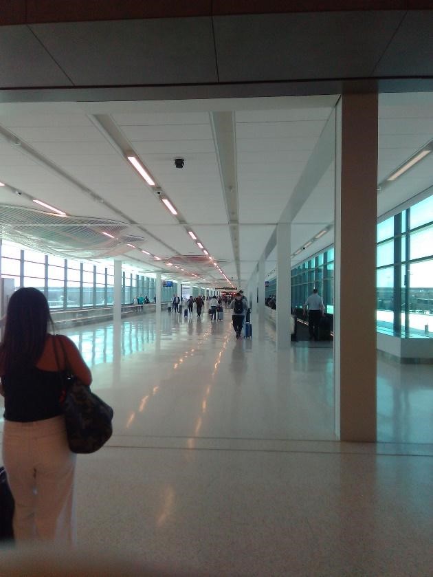
The first impression is one of bigness—too much bigness. The person feels lost in the gigantic spaces, dwarfed by the disproportions. The feel is boxy, not airy. The terminal is a parade of right angles, flat on the top, never pointing upward. The ceilings are high, with upper windows that let in a good amount of natural light.
Help Remove Jesus Bath Mat on Amazon
Thankfully there are no structural I-beams, pipes and other exposed infrastructure so common in other airports. Everything is neatly sealed in a controlled and artificial environment that lets in nothing from the outside and vice-versa. Save for a few ornamental plants at a restaurant, I noticed no living things to rest the soul.
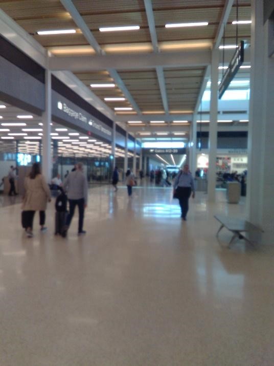
The extra space is disorienting as the central corridors are overly long, sterile and wide. The great distance from the gate to the pickup area has very little to distract the mind except for the periodic murals or screens with messages and advertising along the way. Like many modern buildings, the walls have little color beyond whites and pastels. Thus, the airport suffers from blandness.
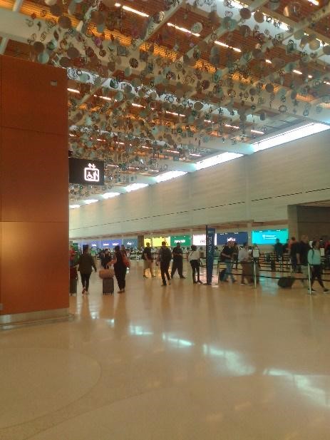
Finally, the check-in area before security is like a massive gymnasium, boxing in the departure area. Covering half the ceiling is row upon row of hanging round objects resembling old farm discs and implements, which leaves the traveler bewildered by their lack of meaning.
Thus, the overall structure is highly functional, largely unadorned, uncomfortably gigantic and utterly uncontroversial. There is little architectural daring or upward movement. It is a place without a sense of place—it could be anywhere or nowhere.
Breaking the Monotony with Monotony
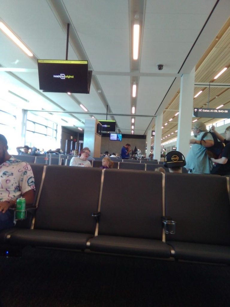
Of course, the new airport is not all wide corridors. The monotony of the dozens of identical gates and waiting areas is broken with the monotony of the standard fare of coffee shops, restaurants, bookstores and snack bars found in most airports.
Satanic Christ Porn-blasphemy at Walmart — Sign Petition
In the center, there is a food court and shopping area that tries to be different. A “city market” offers local-themed and over-priced products especially focused on area sports teams and barbeque. There is little that might be called authentic local culture.
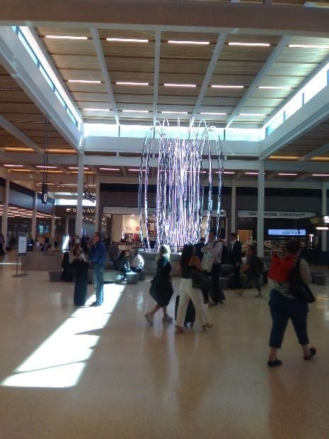
The most significant artistic monument is a large “fountain” consisting of glowing hoops of electric lighting trying to simulate water but without much success.
While waiting outside on the uninspiring curb for my ride, a fellow traveler used the word “soulless” to describe the new airport. I agree. The problem is not the place’s functionality that seems to work well enough. What is missing are the cultural and spiritual aspects that are much more important than the physical workings. There need to be things that speak to the soul.
Soulless buildings appear when our postmodern culture detaches us from our cultural, historical and religious narratives. Unanchored from any single worldview, these bland creations become a pastiche of disconnected styles that asphyxiate us in their triviality. We are left with anti-metaphysical buildings, hollow boxes, empty shells containing little meaning or symbolism. Their giant and sterile corridors reflect the desolation of the postmodern existential journey, blind to any consideration of life’s final goal or purpose.
How Panera’s Socialist Bread Ruined Company
Thus, my assessment of this soulless place with no sense of place is one of frustration. Architecture, even airports, should uplift and inspire the soul to consider higher and wider panoramas. By their logic and beauty, these buildings should speak to us of God, the source of all beauty. I lament that so many new buildings seem designed to limit horizons to the purely material, functional and superficial. They have been sanitized to exclude any hint of higher agency.
I long for architect Augustus Pugin’s “pointed” buildings, full of imagination and brilliance that rivet my gaze and sweep it heavenward.
Photo Credit: © Denys Yelmanov – stock.adobe.com


